Architectural Review: Contemplating the Kimbell
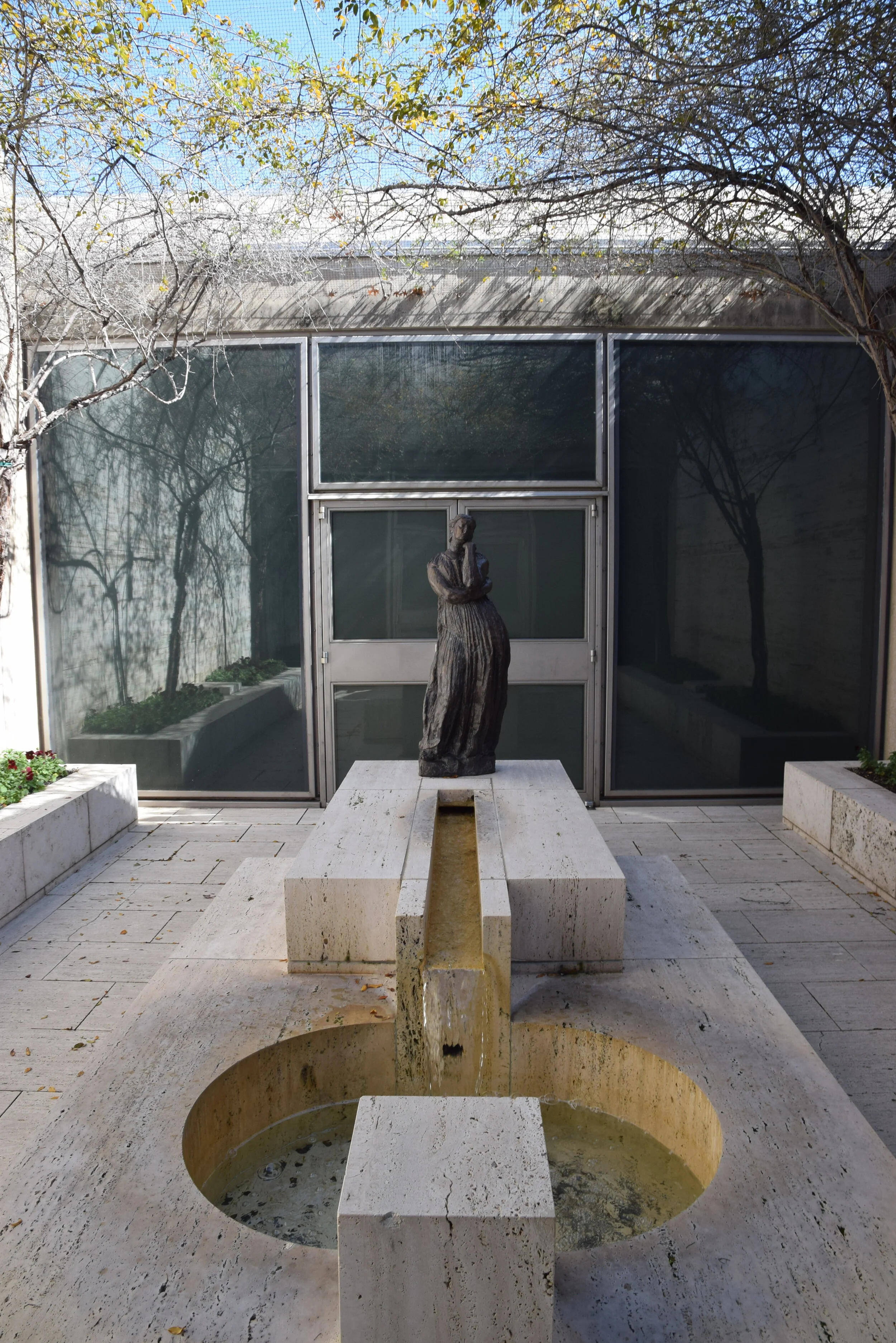
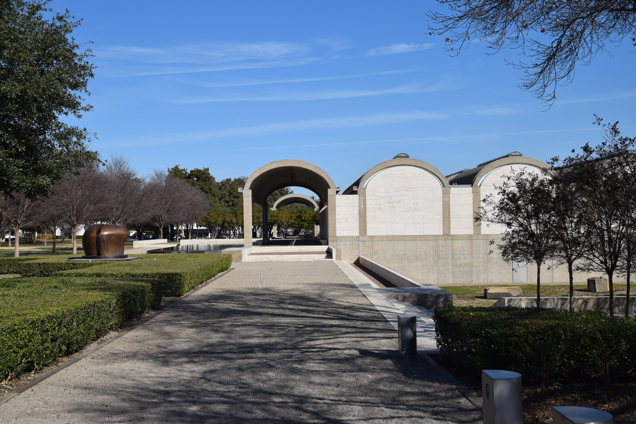
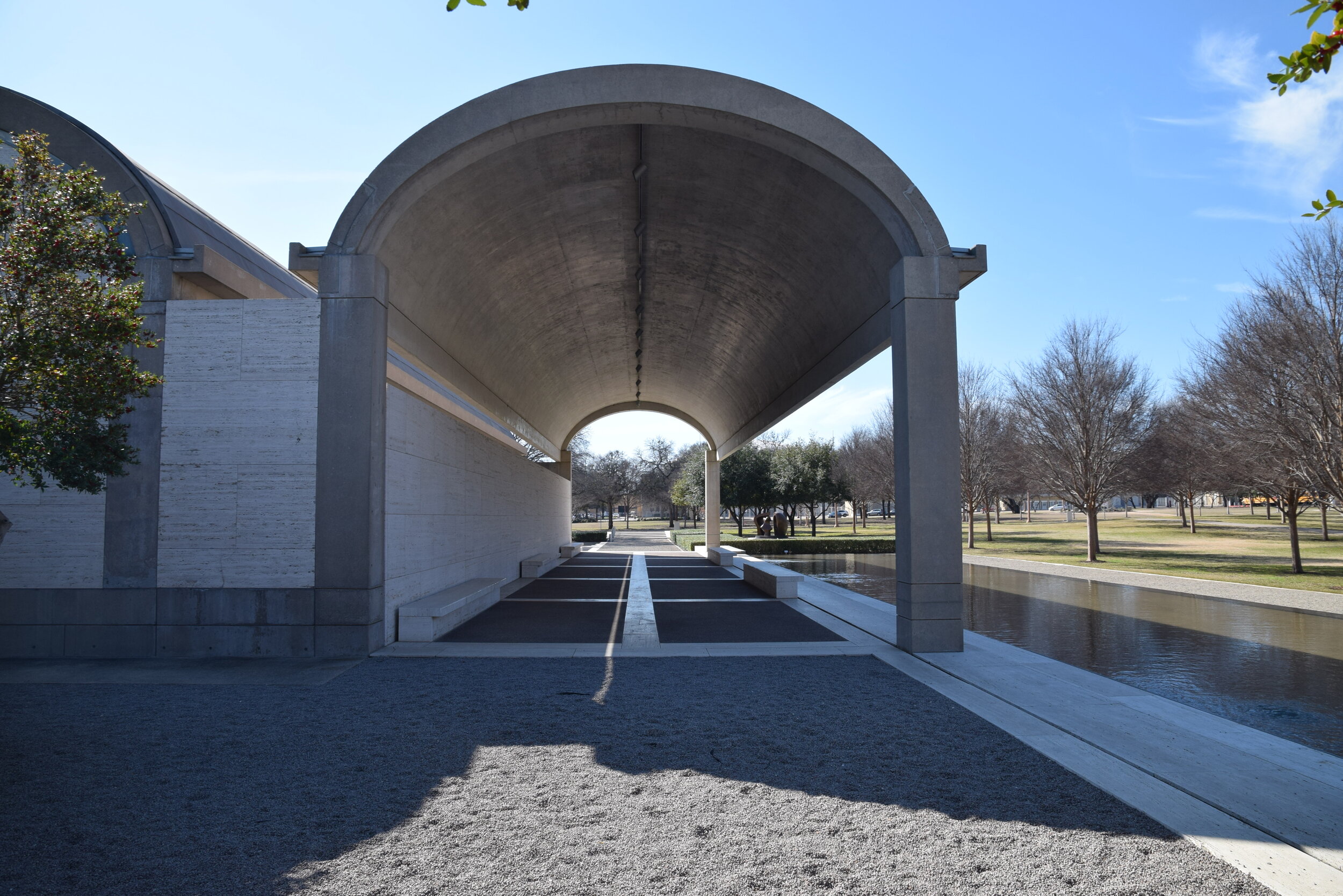
/View of The Kimbell Art Museum’s Entry Court.
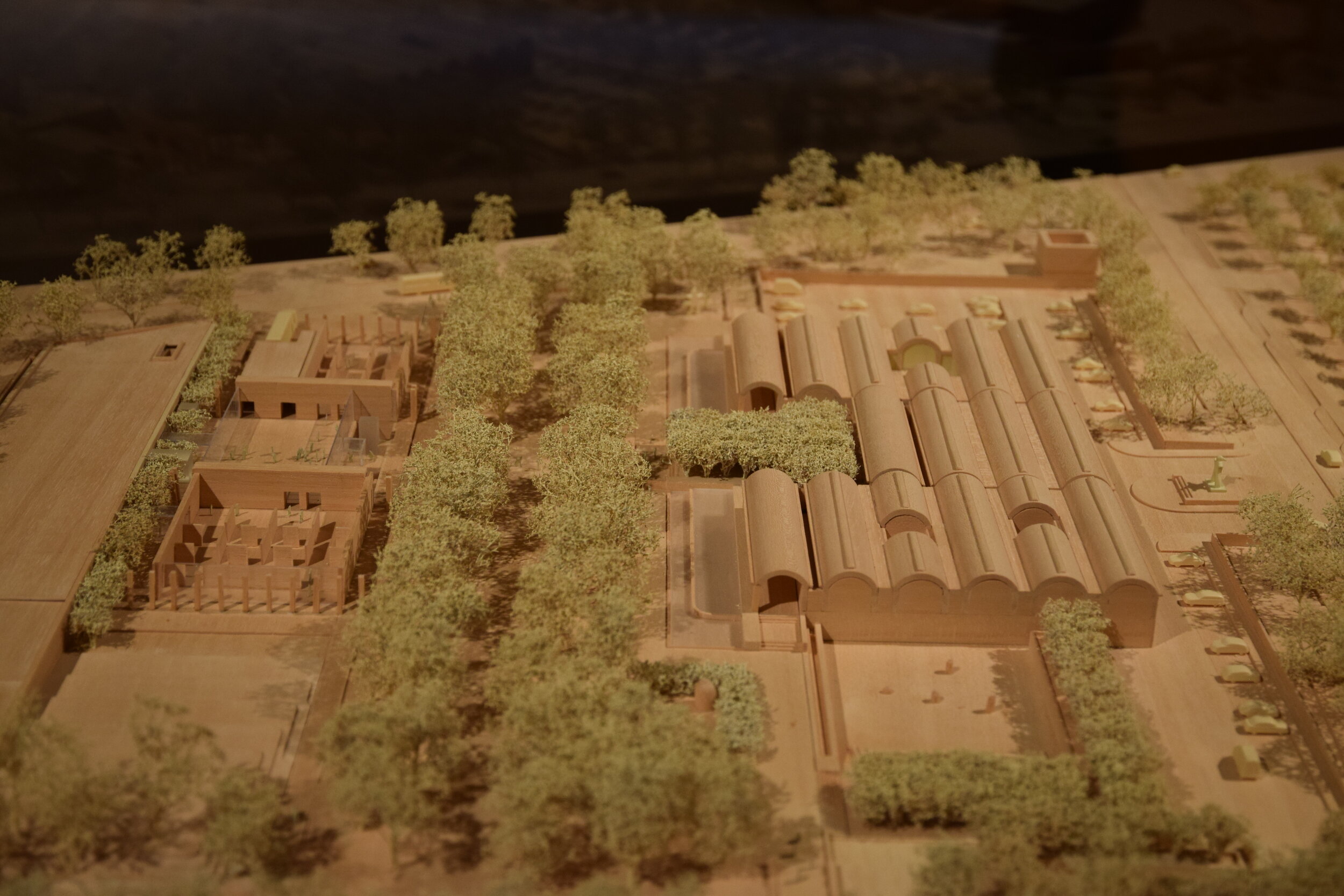
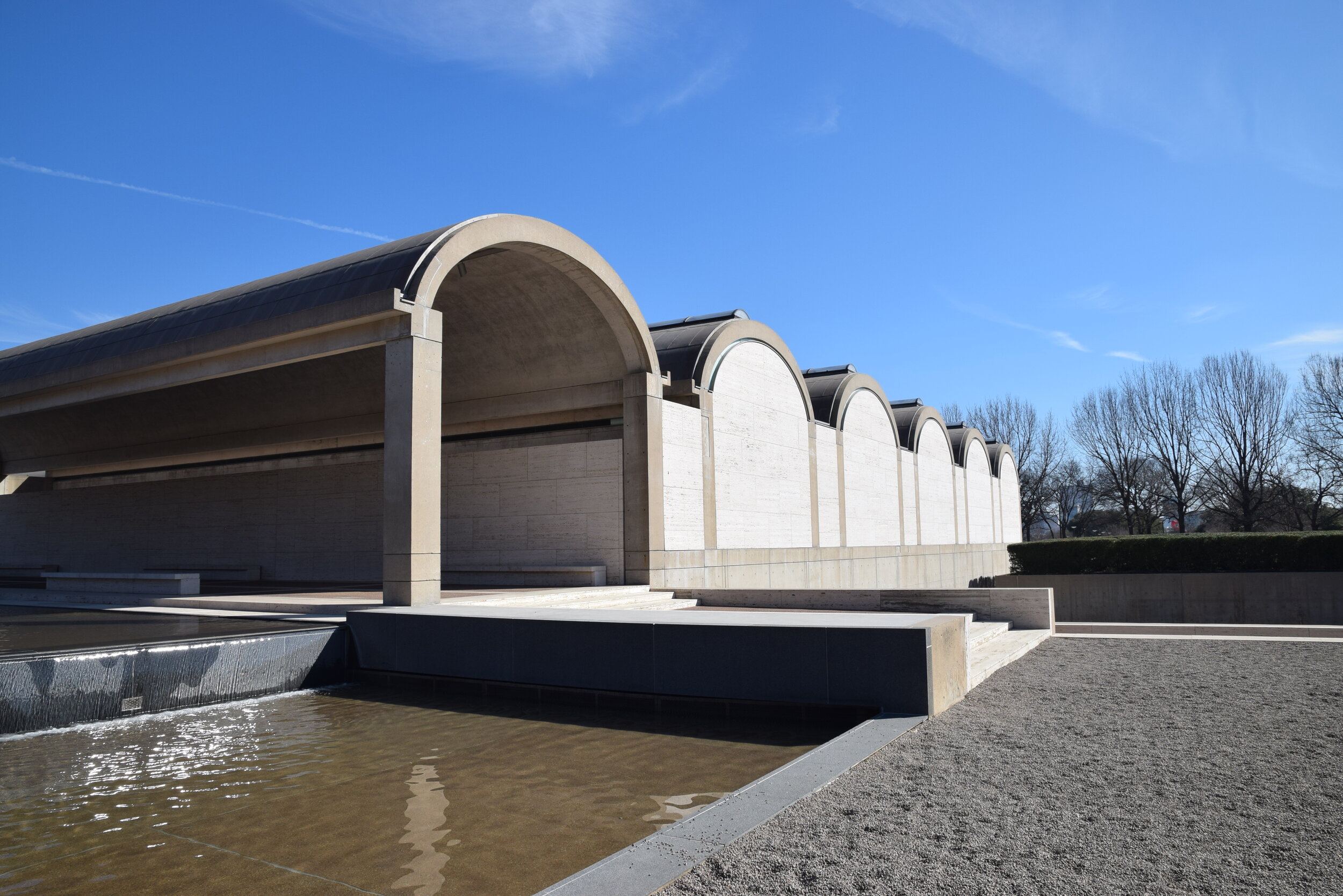
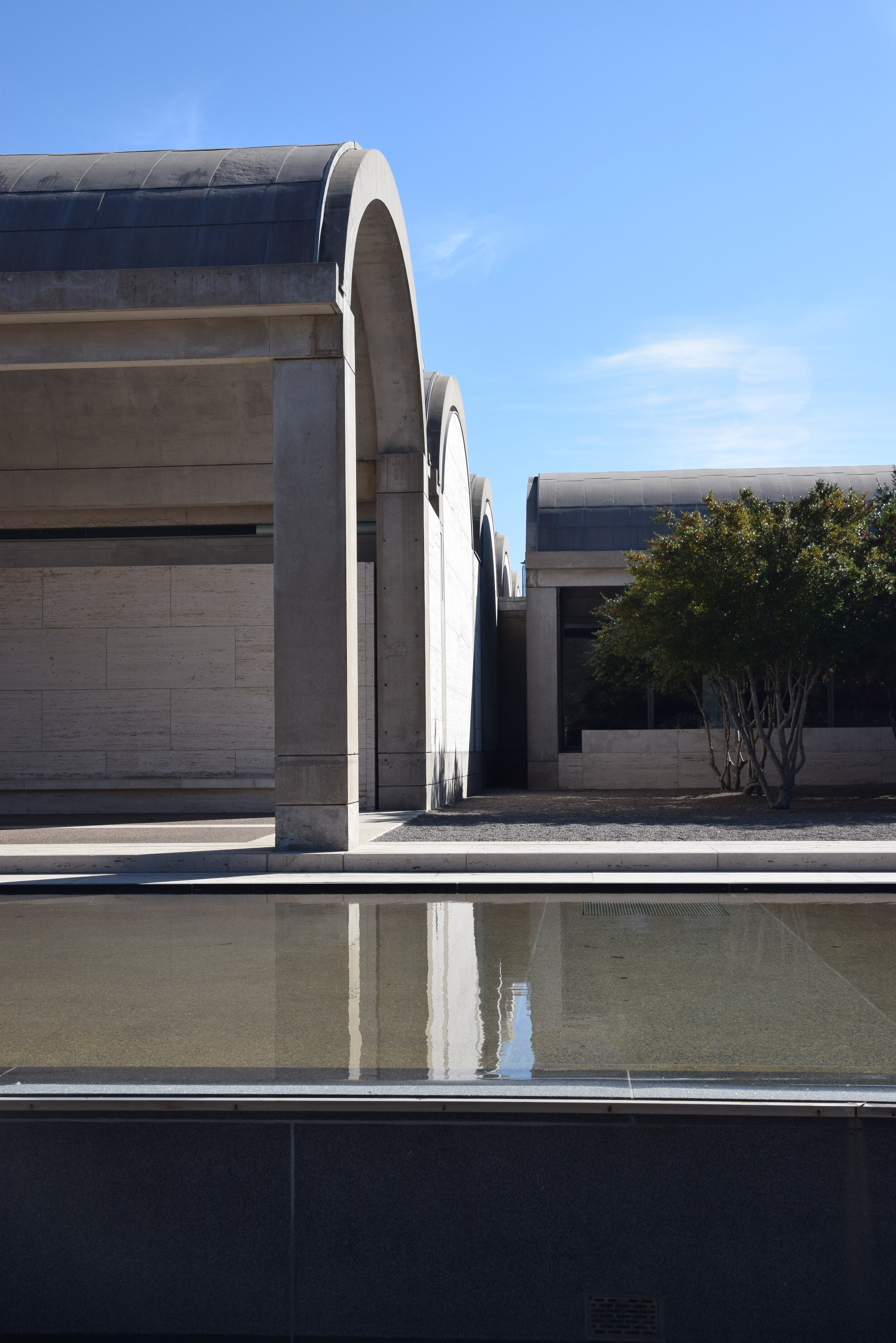
There are a handful of architectural works that are celebrated as masterpieces. At first glance, it can be hard to understand what all the fuss is about. The Kimbell Art Museum is one of these. How can a series of six windowless barrel vaults be breathtaking architecture? How long did it take Louis Kahn to design something so simple, anyway? The answer is on the inside. While the building, like its architect, may appear unassuming, all the complexity is within. Louis Kahn only designed about 30 completed works, not a large number for a longtime practicing architect, yet he is revered as one the 20th century’s greatest architects. Kahn is known for fusing modernist design principles with the timelessness and permanence of classic architectural forms. Modernism’s mantra of no ornamentation and clean lines is often criticized for producing austere and impersonable architecture. After all, architecture’s purpose is ultimately for human interaction. So, for many Louis Kahn’s passion for designing buildings with the solidity of classic forms and geometry makes his modernist architecture more compelling. The Kimbell Art Museum is a prime example of Kahn’s design philosophy and why it’s so enduring.
Exterior
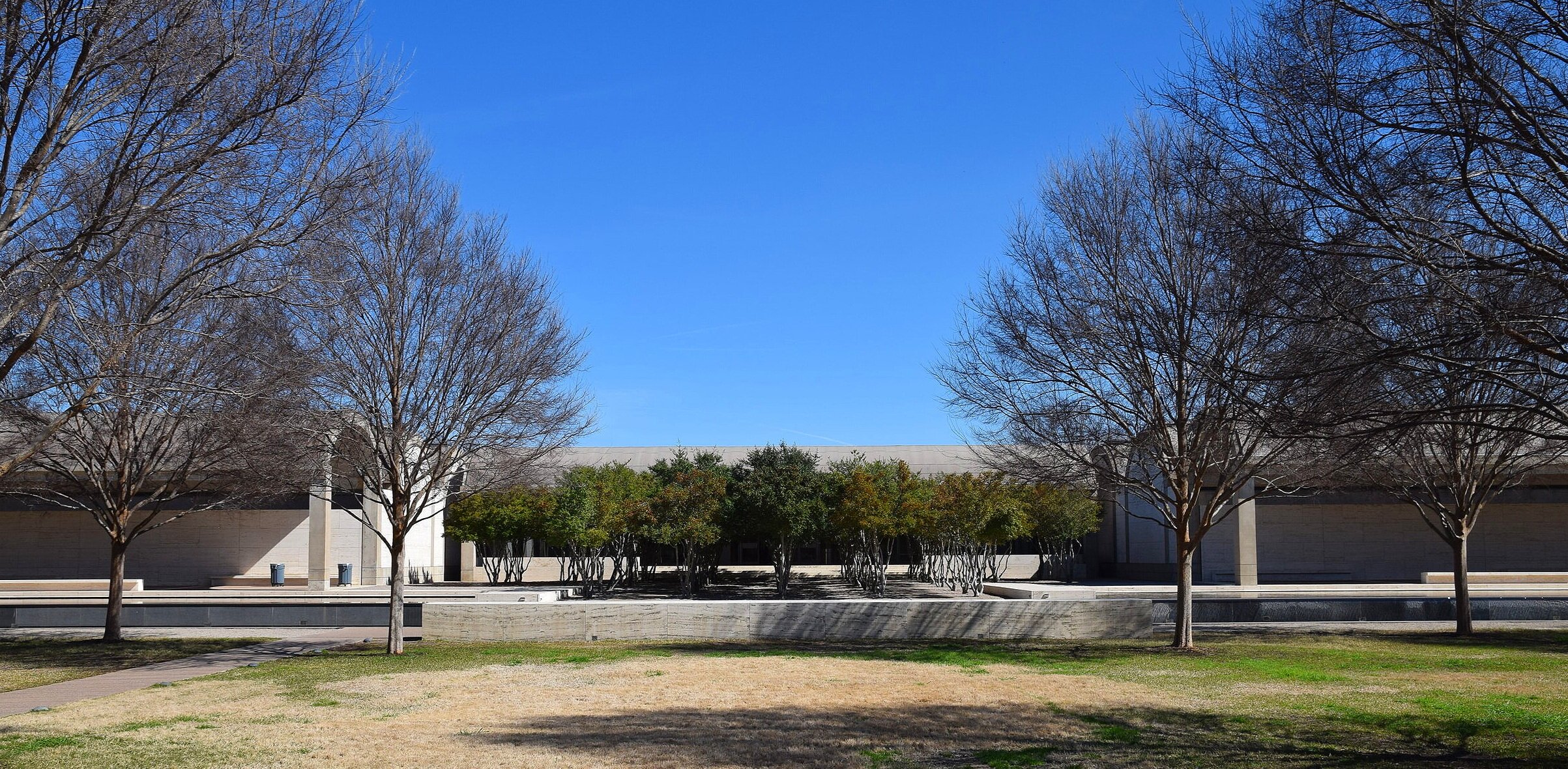
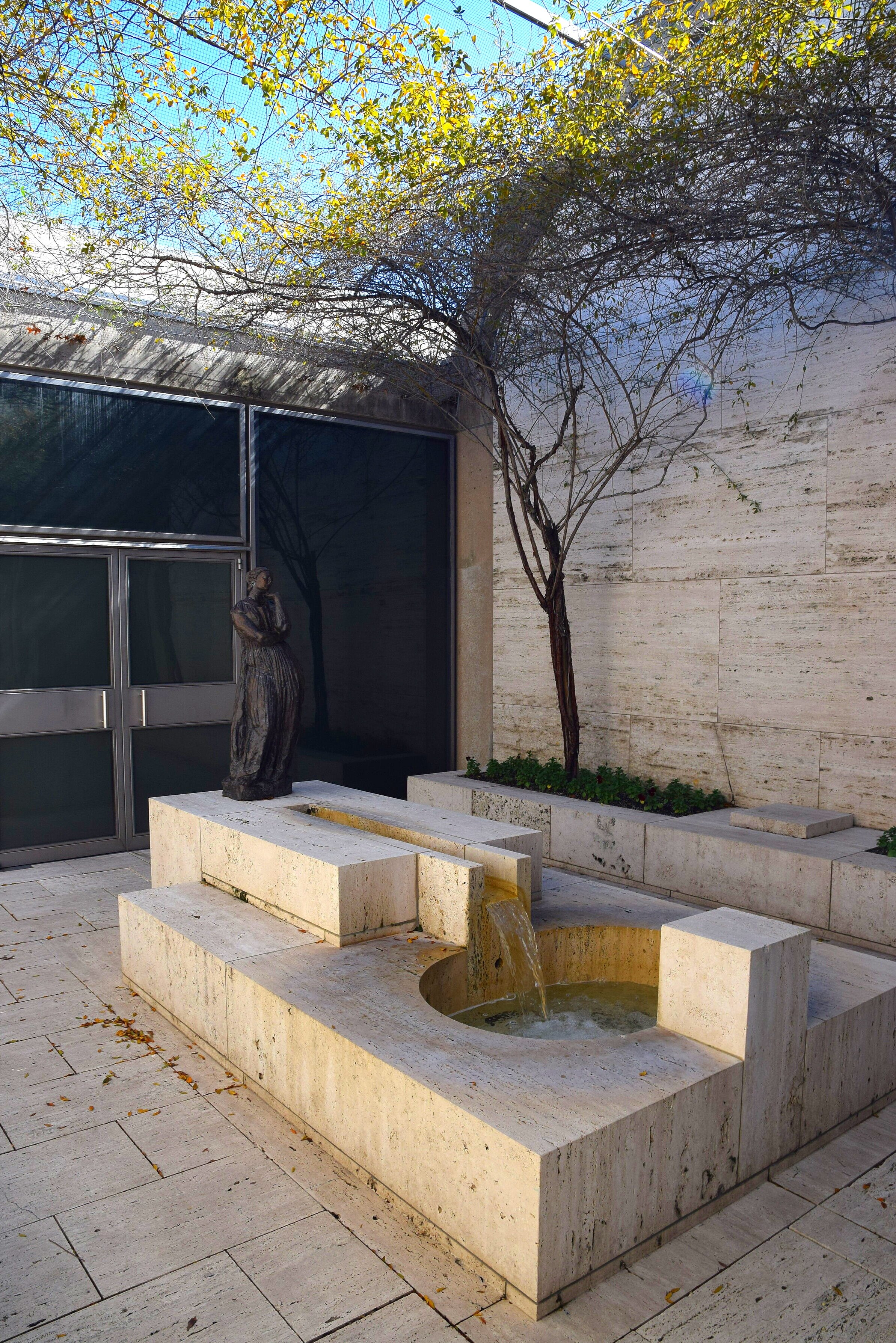
The Kimbell’s exterior is deceiving. The simple and elegant vaults are scaleless without windows. Their shape suggests a grand covered space equal in scale to a covered market or train station. However, the height of the building is a mere 20 feet. It’s hard to get an idea of the scale from the entrance, as it is obscured by an allee of trees. But the entrance court of the Kimbell Art Museum begins to unveil Kahn’s ability to create a procession that leads visitors to an incredible interior for enjoying art.
Interior
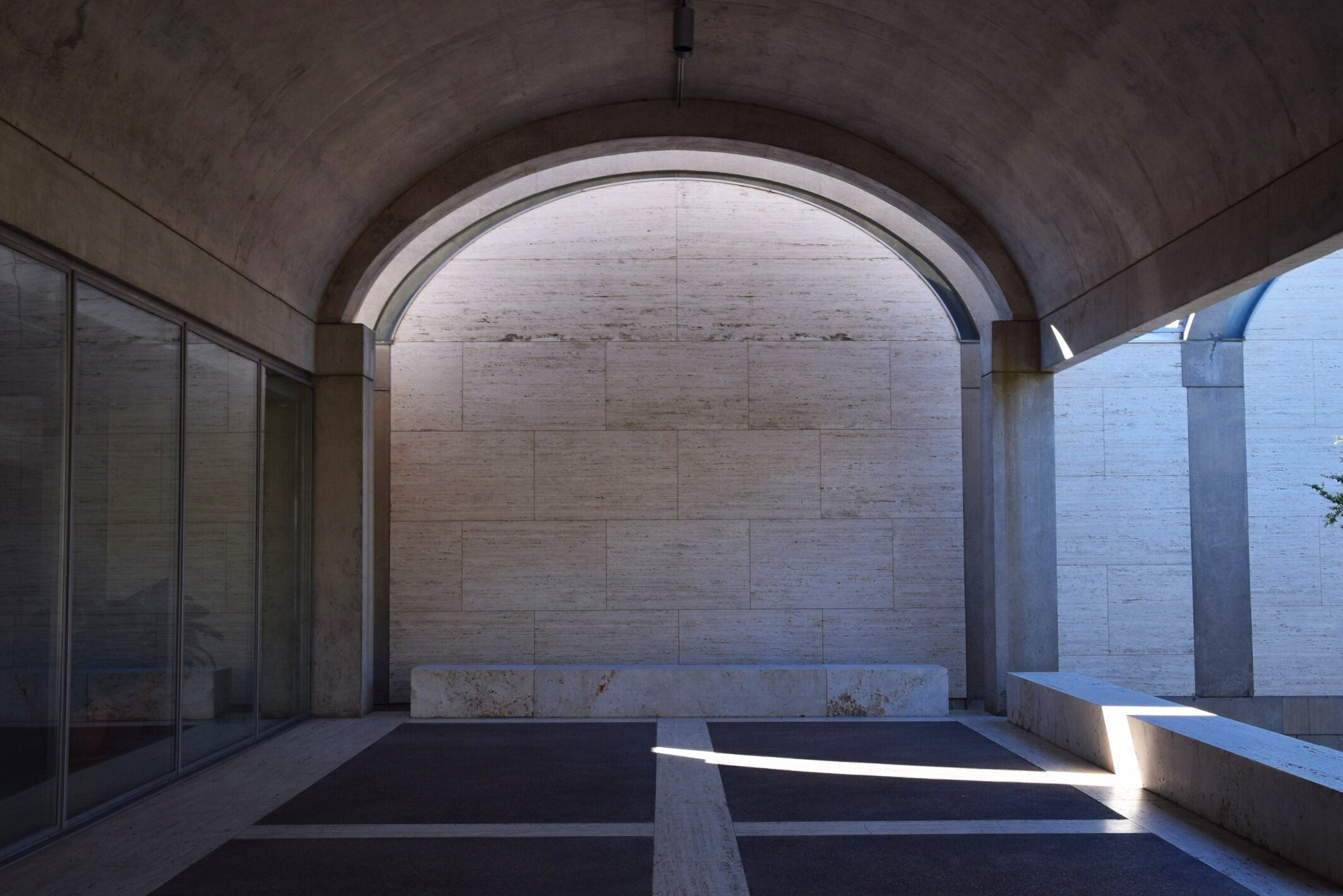
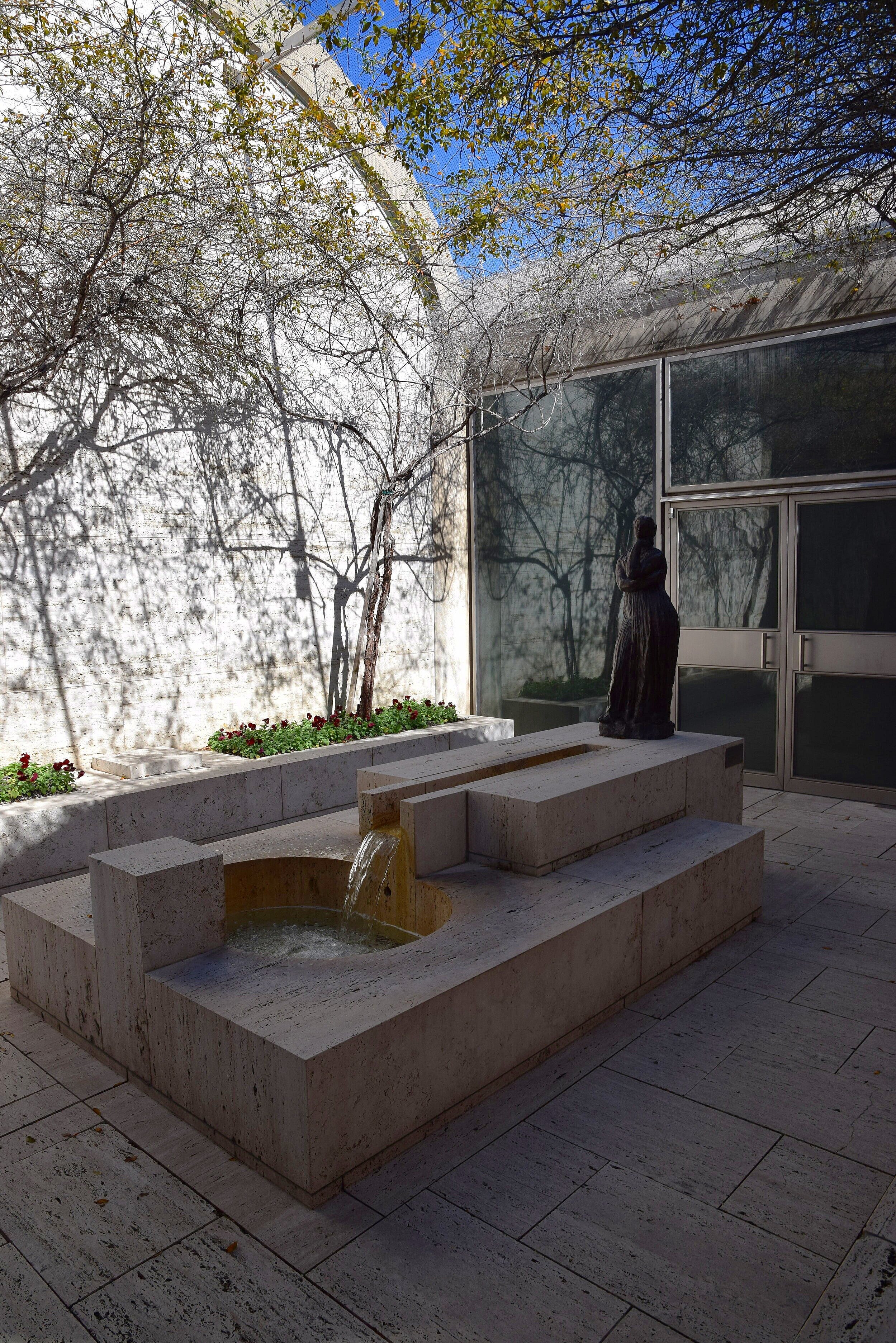
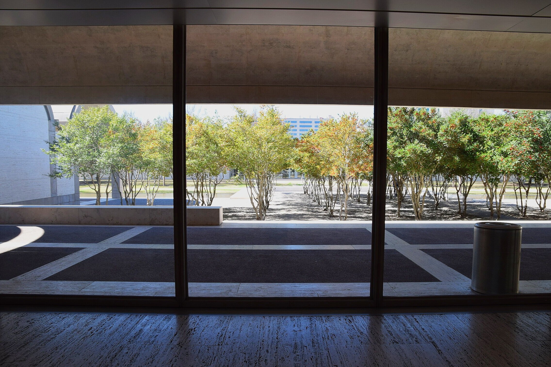
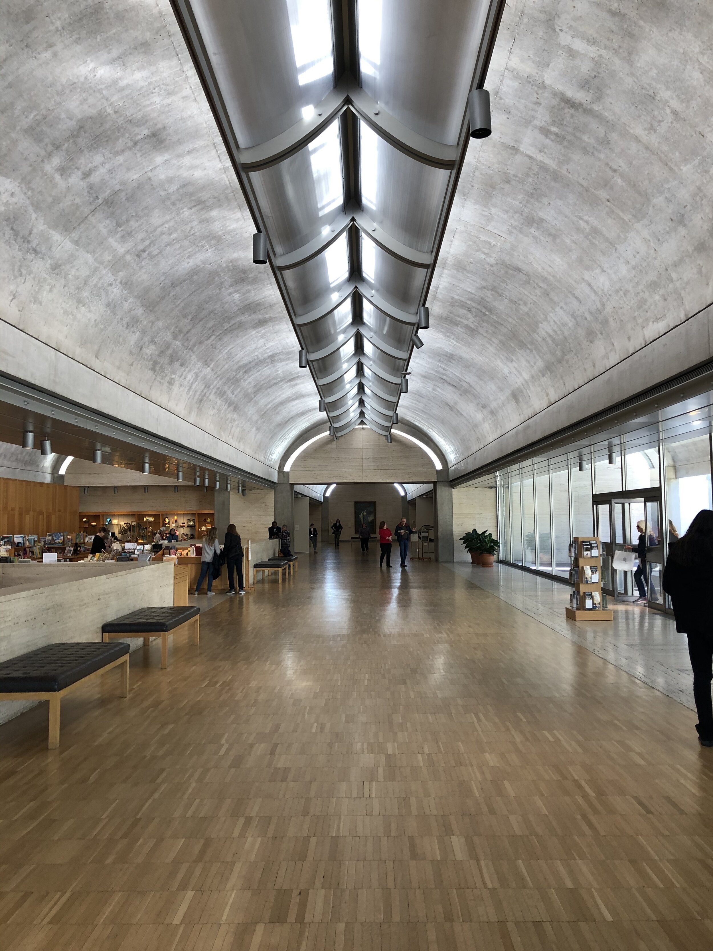
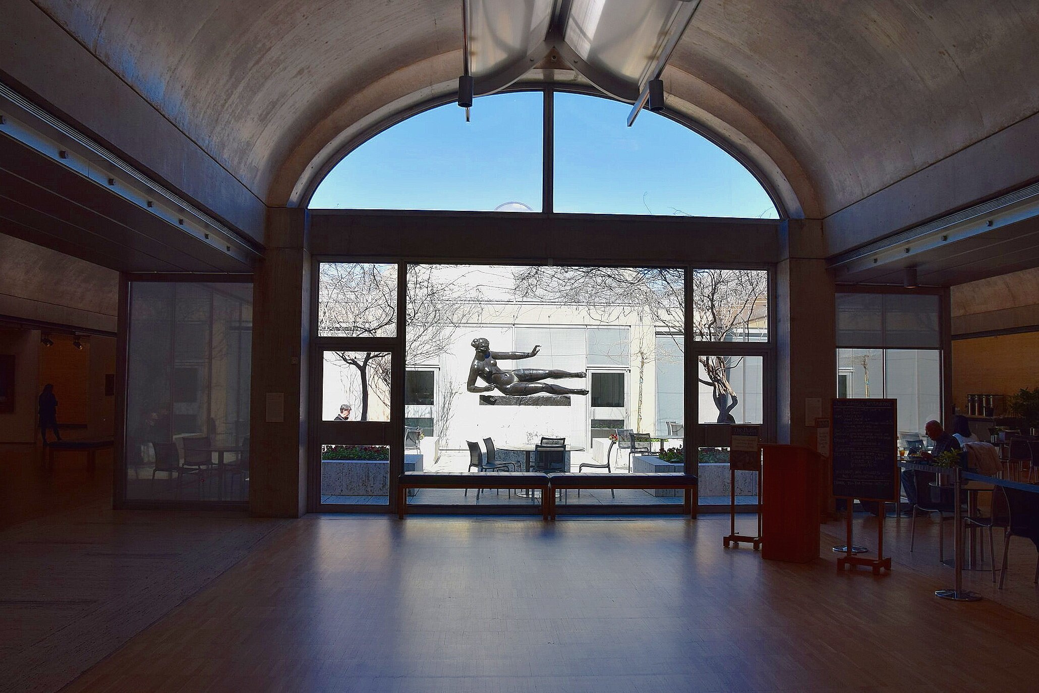
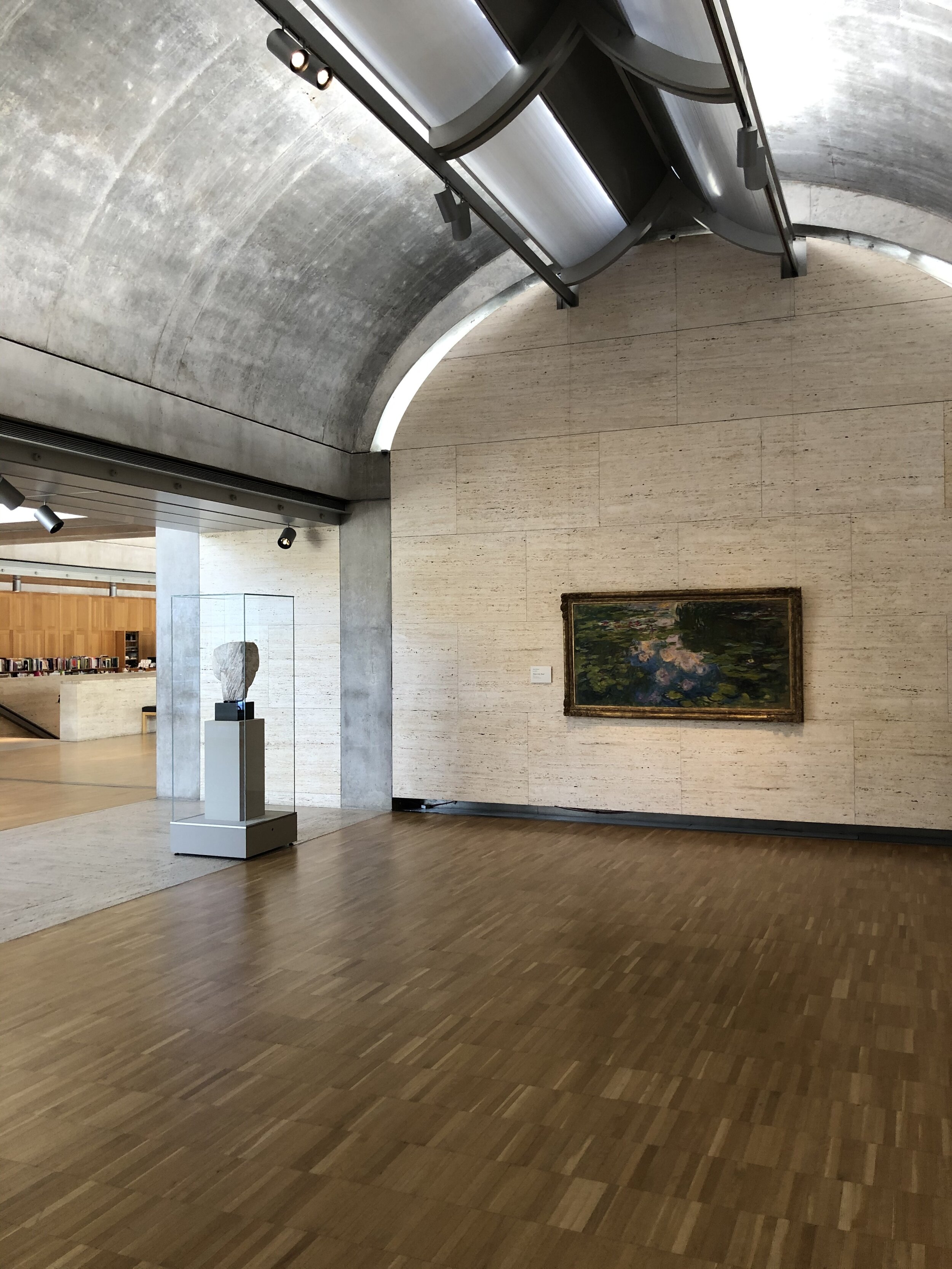
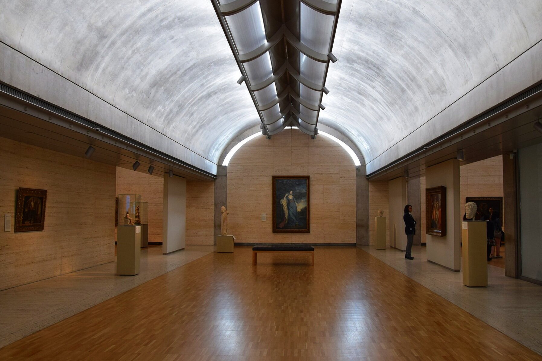
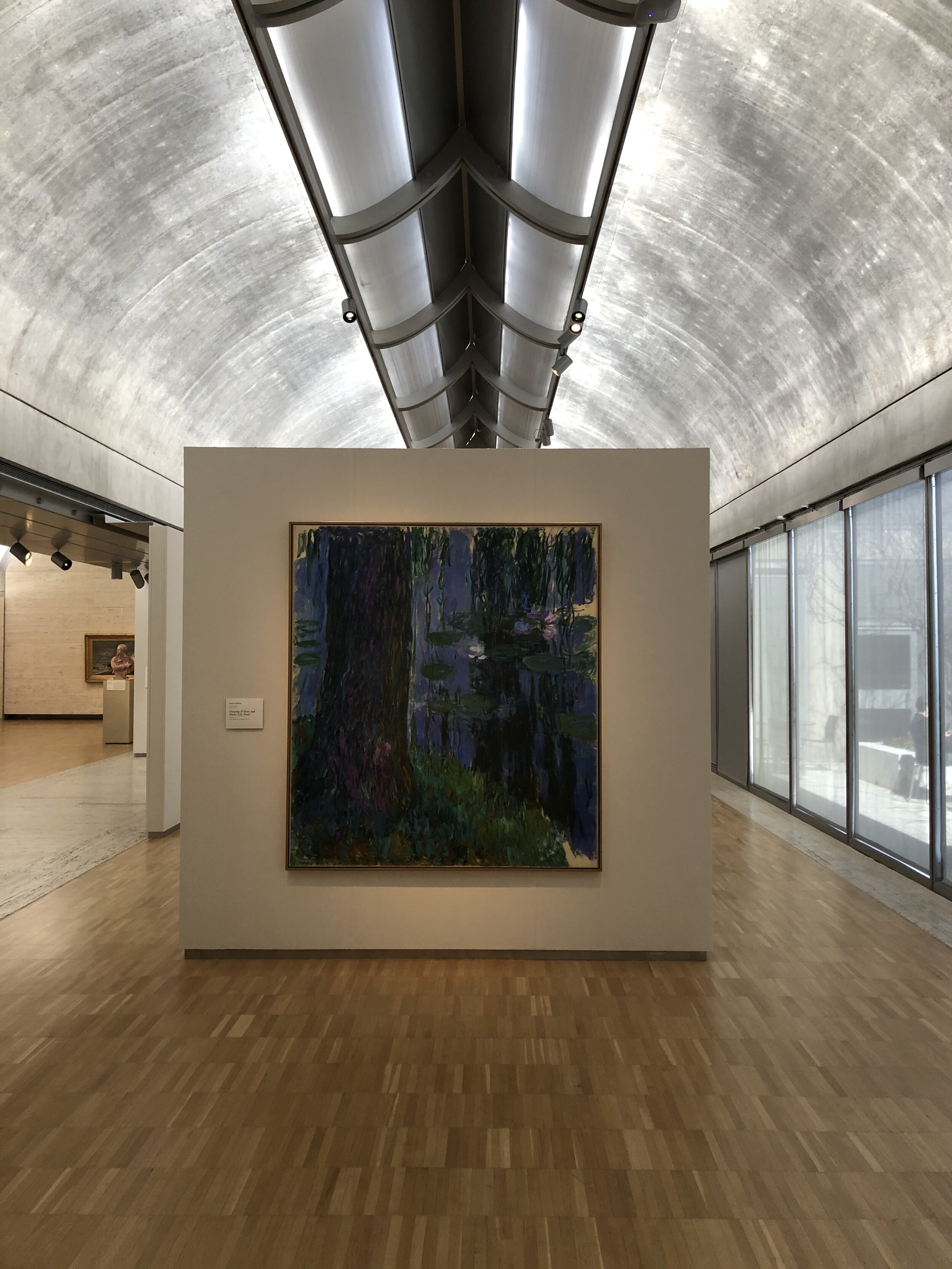
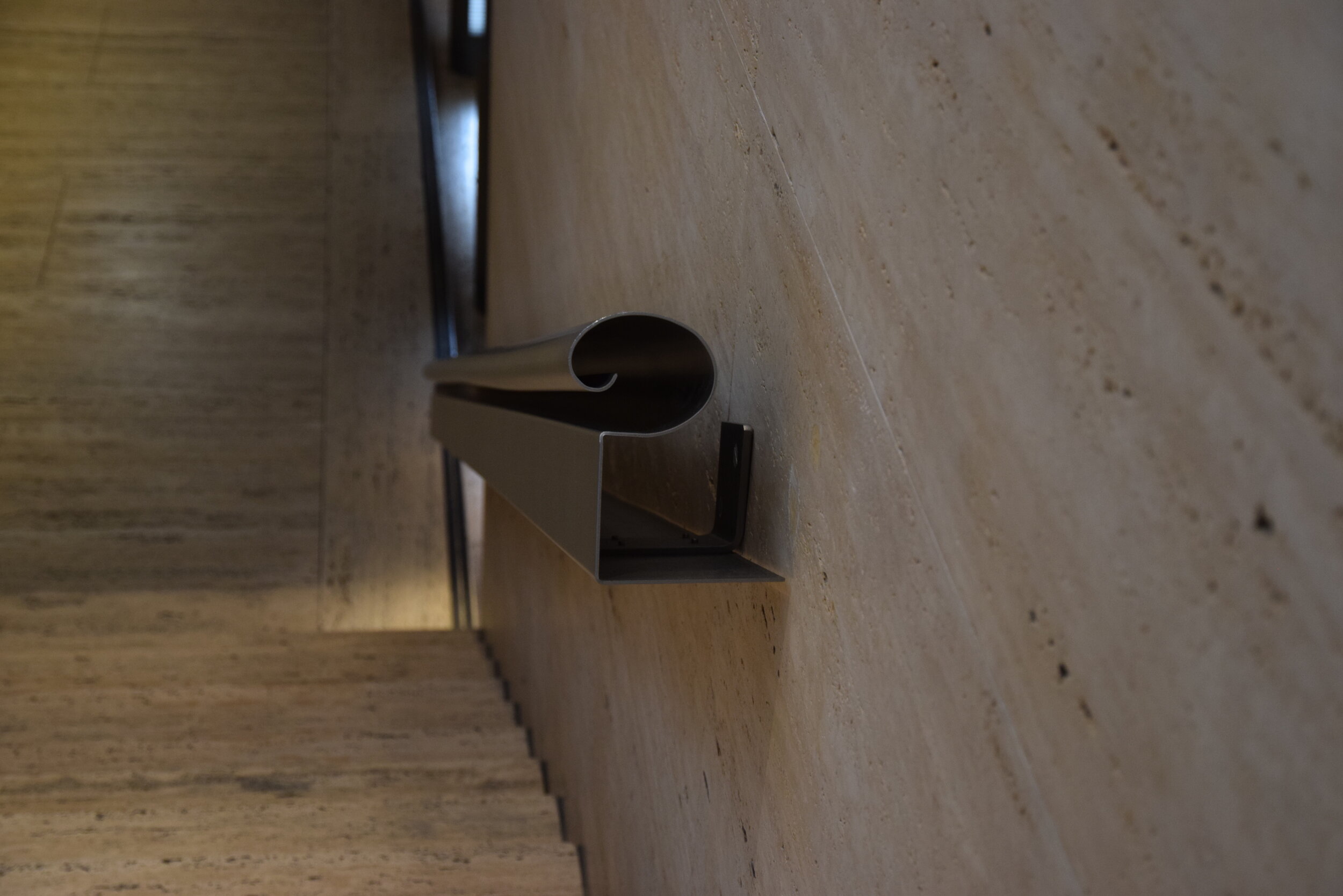
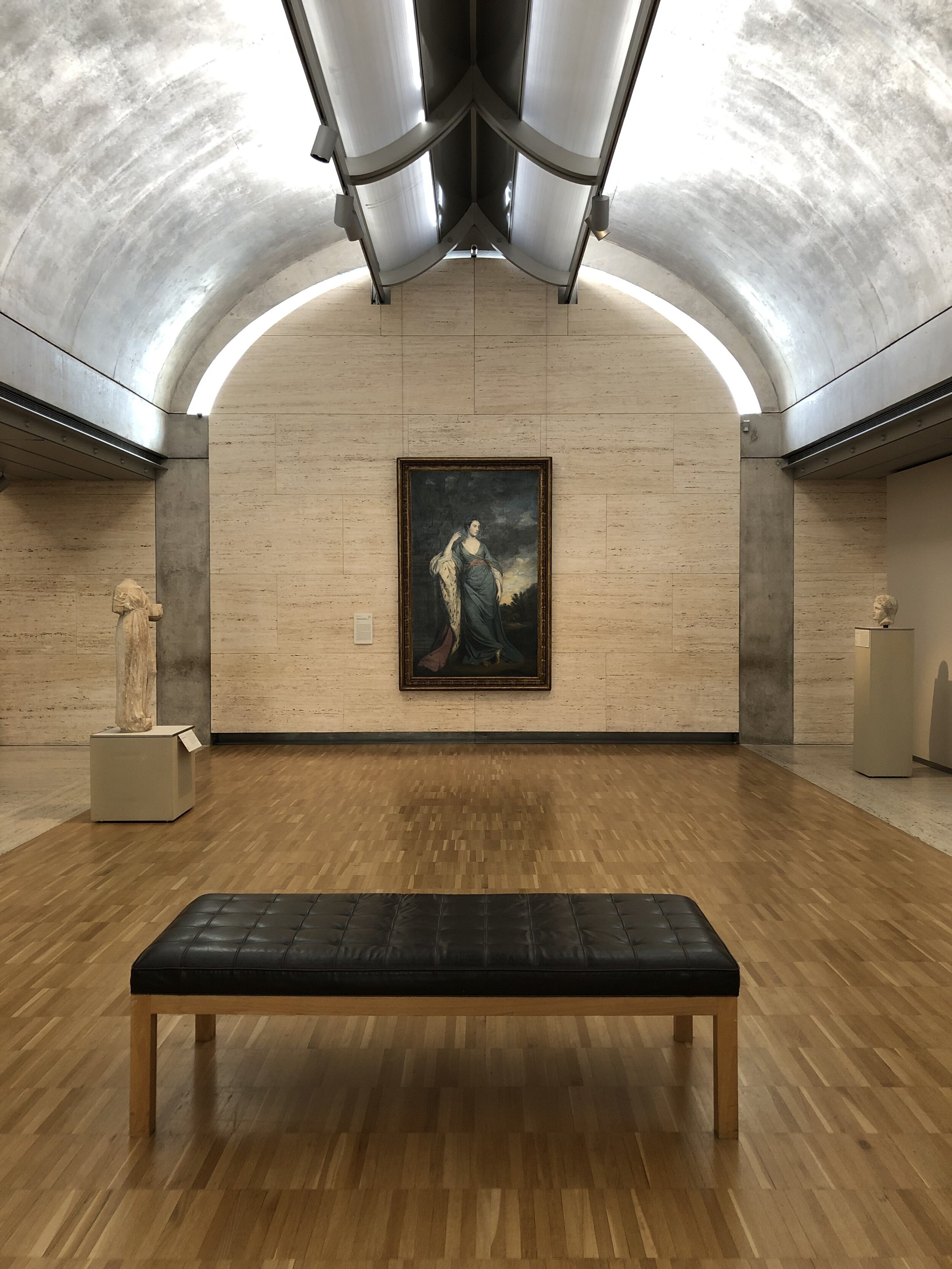
The space Kahn creates to view art is relaxing and contemplative. Known for his fascination with the way natural light defines the characteristic of a space and its experience, Louis Kahn’s only window into the museum is a glass entrance, providing shade from the intense Texas sun with one of the open vaults. This gives ample wall space to display art and also sets a somber mood to prepare visitors to reflect on the art they are about to experience. The museum is not dark, though; Kahn designed a unique slit down the center of each vault with a screen that filters in daylight and spreads it along the graceful arc of each vault. The result is a gentle light, perfect for viewing art while preserving it. The light shows off the travertine tile and wood floor to create a space that feels open, meaningful and warm. This is truly the genius of the Kimbell: Kahn’s ability to create such a beautiful interior perfectly attuned to its purpose in a such an unassuming arrangement of simple barrel vaults. See for yourself.
Bonus: 2013 Renzo Piano Expansion
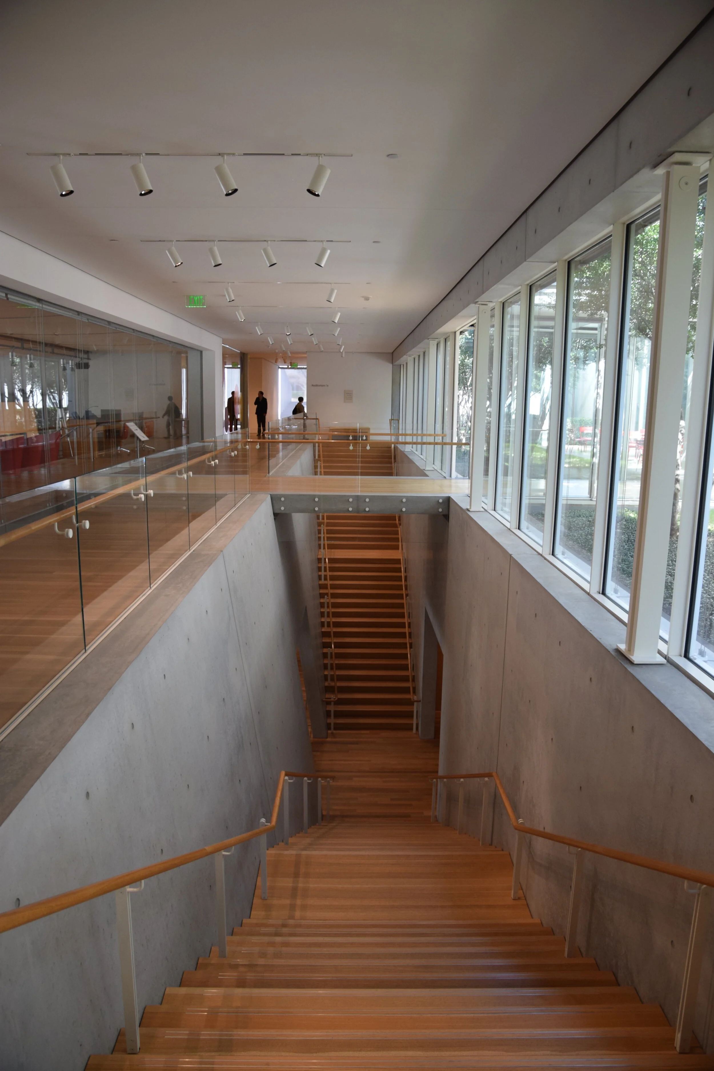
Due to the modest size of the original art museum, an expansion was opened in 2013. Design privileges were given to renowned architect Renzo Piano. Known for his attention to detail, he created a facade that does not appear as monolithic as Kahn’s design. However, the design sits across the courtyard from the original museum and reflects the bay organization that Kahn established, using new materials and sun-screening louvers. The design is also partly submerged in a mound that is the entrance for underground parking. The new space has additional galleries, a lecture hall and entrance hall for receptions.
Are you a fan of Louis Kahn’s architecture? What’s your favourite Kahn design? Have you been to the Kimbell Art Museum? What are your favorite museums? Leave a comment; we’d love to hear from you.
Places and Perspectives is a blog devoted to exploring topics and images that inspire the sense of place. We always welcome suggestions of places readers want to learn about and see featured on our blog.


